Our Logo
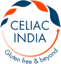
Our logo embodies our essence and our dreams.
The positive change that we want to bring about in the lives of celiac patients is reflected in the increasing size of leaves, leaf itself being a symbol of growth.
Through our efforts, we want the celiac families to be able to not only lead a life where their basic gluten free concerns and needs are met with but go even a step beyond where gluten free is made available easily and celiac disease is not ‘foreign’ anymore in schools, restaurants and hotels.
Our ultimate aim is for them to have such resources and options at their disposal that gluten free is not a concern anymore -a time when they continue living gluten free yet have the freedom to freely think beyond gluten free and focus their energies on other aspects of life just like others.The arrow indicates our continuous efforts in this direction.
Indigo signifies our Indian essence; our initiatives and efforts which are geared towards the Indian community – patients, doctors, and others and our emphasis on change based on ingredients available in India. Orange not only exudes positivity and health which is our wish for all but has always signified spirituality for us for times immemorial.
When I see this logo, I also see a face of a child smiling.
Isn’t this smile on all our celiac children’s faces all that we strive for?

